
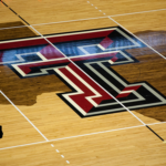


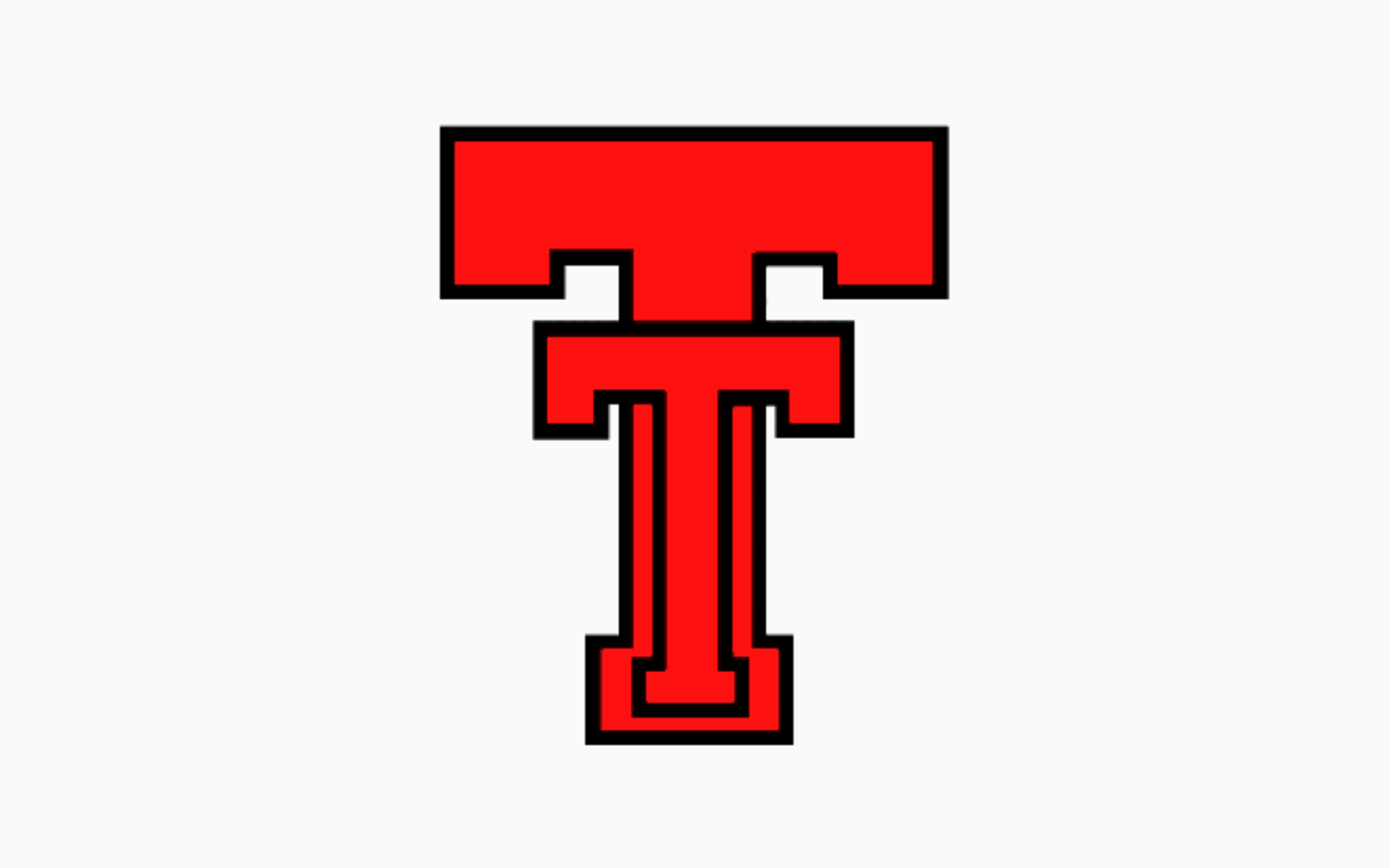
I cannot recall when I stopped using the beveled Double-T, but it has been years, perhaps as long as I’ve run STP. Regardless, I have essentially thought in my mind that the flat Double-T is really the only good logo and because I get to do what I want, that’s the logo that I’ve always used. Yesterday’s announcement by Texas Tech was that the beveled Double-T was going by the wayside and beginning in 2026-27 the flat Double-T would be the main mark for Texas Tech. In fact, based on the video, the Double-T utilized in this post isn’t going to be the Double-T, the top of the T is going to be elongated just a bit. This video explains quite a bit of the thought process.
This is the progression of the Double-T:
We aren’t going back, we’re moving forward. pic.twitter.com/TvPpJA6zfC
— Texas Tech Red Raiders (@TechAthletics) October 7, 2025
And the secondary marks have also been updated, which was greatly needed. Those things needed to be cleaned up, particularly the Masked Rider. And the flat Double-T lends itself to look great with different outlines and that’s absolutely true.
As part of our future brand identity, the iconic Double T not only gets a modern twist that features proportional design elements, but updated colorway options for maximum versatility. pic.twitter.com/4KKcdSr4pj
— Texas Tech Red Raiders (@TechAthletics) October 7, 2025
Tradition with a modern twist pic.twitter.com/065JzWiYWz
— Texas Tech Red Raiders (@TechAthletics) October 7, 2025
I’m obviously ecstatic about the move and in the grand scheme of things, it was long overdue. The beveled Double-T was always a bad design and you’ll never convince me otherwise (designer: can I figure out a way to add a 15th 45 degree angle to the Double-T? I don’t know, but I’m going to die trying). I’ll update my end of things once the new logo is released as part of the branding project. I also do not care what anyone says on the internet. And for what it’s worth, you should not care about my opinion either because your opinion on the matter is neither wrong or incorrect (unless you love the flat Double-T). Literally, I don’t care.